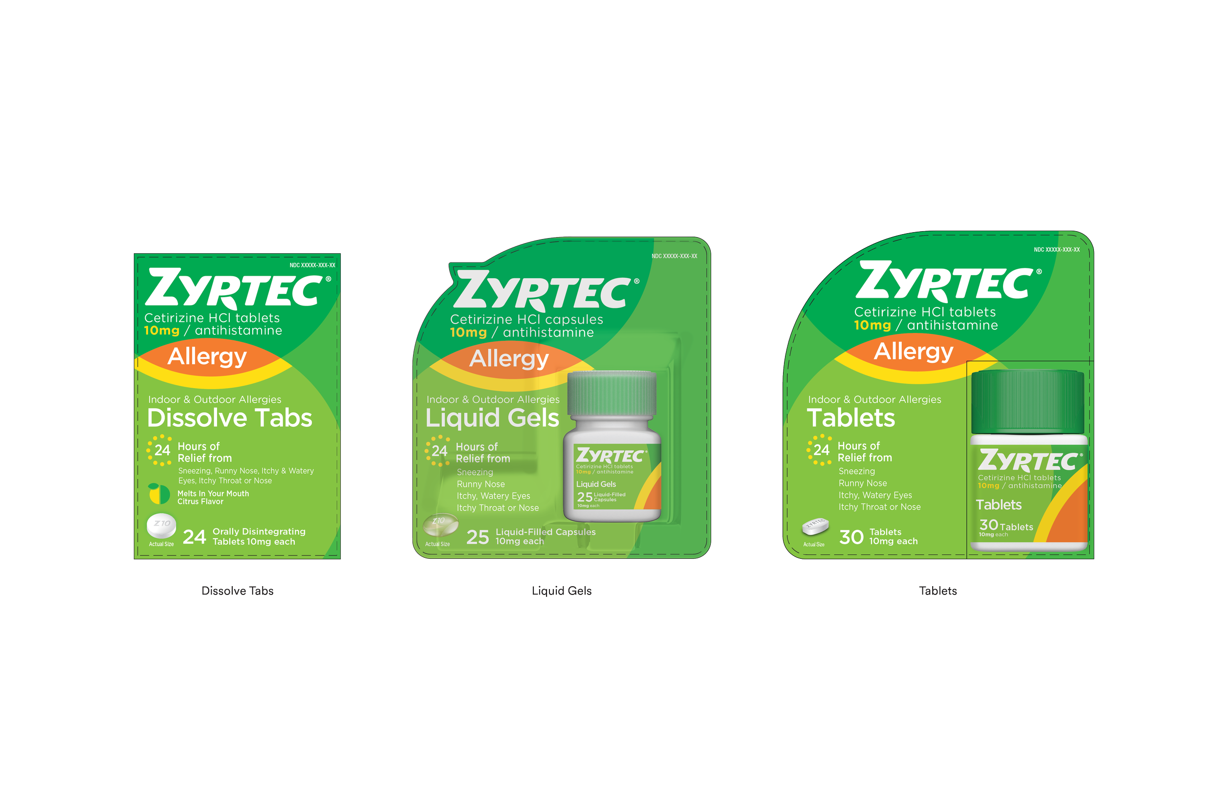
Zyrtec Restage
Product Packaging, Brand Identity
Client: Zyrtec
Studio: Johnson & Johnson Design
Industry: Consumer Healthcare
Design Manager: Sarah Foley
Lead Designer: Kelsey Welch
Design Support: Bryan Barham, Liz Cansfield, Tyler Courtenay
This restage of Zyrtec packaging and brand assets was initiated to align with the brand’s new visual and verbal brand language. Outlined in the brief were these key attributes: serious, confident, tough, genuine, vibrant, and joyful. Rather than a complete rebrand of Zyrtec, this project intends to update the brand’s look and feel while leveraging the iconic elements known to consumers.
To support the restage, I contributed the two design directions seen below. Each of these a part of a unique territory outlined by the design team.


